 I recently got a shiny new Macbook from my advisor. While I’ve briefly used a Mac a few times in the past, this is the first time that I’ve ever really worked on one. I can appreciate that it is a very attractive laptop, but I’m less convinced that this machine is supposed to provide the ultimate user friendly experience, particularly for users who like flexibility in how they work on their system. I make an effort not to complain about things here since that is what 90% of blogs are, but unfortunately I need to relax that rule for this post…
Design and Layout
Of course it is very pretty. It is smooth and shiny with some great curves (for a laptop). The trackpad has a nice feel, and scrolling up and down in documents is great – you just use two fingers and move them up or down and somehow it figures everything out for you. On the other hand, it only has one button. I have never understood why apple only puts one button on its mice since being able to right click to get a menu is an extremely handy thing. This really represents the basic apple design philosophy to me – cut out the extras to make things simple for someone just learning, often at the expensive of power and flexibility for more advanced users. While you can get around this by either holding special keys or tapping with two fingers, there remains now way to do things like drag the cursor while the right mouse button is clicked, something I use regularly for shortcuts in Firefox.
Shortcut Keys
 The result of the Mac being so simplified is that it becomes increasingly important to know complicated shortcut keys in order to get anything done. Sometimes this is quite confusing, for example on the Macbook keyboard the arrow keys also work as the page up/down and home/end keys. I’m fine with them reducing the number of keys on the keyboard by doubling these up, but it doesn’t make any sense at all that to use home and end you need to press the “apple” key and an arrow, while to use page up and page down you need to hold the “fn” key and an arrow. Why not be consistent?
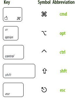
The symbol representation of keys on the apple keyboard and within applications adds even more confusion. In windows, a shortcut will typically be labeled as “ctrl-z” or “alt-n”, while on the mac they insist on using bizarre symbols to represent the ctrl or alt keys as shown to the left. It would be fine if those symbols were also printed on the keyboard, but they are not. How am I supposed to guess that a weird picture of a stair case with a minus sign on it corresponds to “alt” (oops, I guess it is technically called “option”). Even their special apple key (already a symbol) requires a second symbol to be represented on screen. No key should require two graphical symbols (an apple with a bite out of it and the crazy indescribable shape at left), a full text name (command), and an abbreviation (cmd).
The Menu Bar and Windows
In Windows and Linux, every window has its own menu bar with things like “File”, “Edit”, etc. On the Mac, there is only one such menu bar, and it always resides at the very top of the screen. For a windows/linux user, this is a bit confusing at first, but isn’t too bad to get used to, although it becomes more of a problem if you hook a second monitor to your laptop, since you only get a menu bar on one screen.
What is a problem though, is how the buttons to start programs on the Apple “dock” tie in to these windows. The dock is similar to the start bar in Windows, and the first time you click on a button for, say, Firefox, it will open up a new window for that program. But then suppose you decide you want to open a second Firefox window. You’d think you could just click that handy Firefox button again, but sadly no. Since Apple has eliminated any sort of task bar listing what programs are currently open, the dock must function as both a place to start apps and to see what is running. Thus clicking that Firefox button merely highlights your previously opened window, it doesn’t open a new one. To actually open a new window, you must navigate through the menus, or learn some keyboard shortcuts (and memorize the figure above).
In the End
Clearly some of my issues with a Mac originate from me being a long time Windows/Linux user, but even so, it is not clear to me why the Mac needs to be different in so many cases. Life for everyone would just be so much simpler if there was a little communication between these manufacturers so that in all of the operating systems “ctrl-c” would be copy, rather than having to switch between that and “apple-c” when I change machines.
The Macbook also clearly has some benefits over previous machines I’ve used. The fact that there is a very limited set of supported hardware does mean that things are more stable (although clearly that comes at a cost). As someone used to the power of a Linux terminal, I greatly appreciate that OS X is based on BSD (essentially Linux), providing me at least one familiar interface. This also makes it relatively easy to run a lot of open source software originally designed for Linux, which is great since otherwise Mac software choices can be limited.
The design is very pretty, and the small power adapter and magnetic plug are nice touches. In the end, the Mac’s simplicity does make it beautiful and makes some things very easy, but it also can make some trivial tasks seem complicated and prevents the power and flexibility which many people have gotten used to from more general purpose operating systems like Windows and Linux.
Wow – in just your opening paragraph I’ve learned so many new tricks to using my MacBook… I’m a die-hard Microsoft man – I run a team of Microsoft-platform developers and a team of Microsoft Network Administrators – and even a Microsoft Accounting system… and an absolute pro on every M$ operating system ever released… but decided a Mac would be fun to play with, and with the excuse of playing with iPhone development, bought a MacBook Pro. I “force” myself to use it all the time at home, but some of the simple things like page up/down and home/end were starting to annoy me. Also, I wish there was better info about the double-finger scroll – that’s handy.
It’d be really cool if someone kept this going with all the differences in an easy reference – I live by shortcuts (Windows-R for the run window, then “iexplore http://www.yahoo.com” to get to web pages… CTRL-N for a new page… etc., so I don’t mind learning – just need some usable reference.
Either way, I’m already a little closer to some of the basic necessities!
Thanks for showing some tricks and shortcuts to my Macbook. I just recently got my Macbook too…one week now since I’ve got it. I kinda agree that there are aspects that are better in Windows but I’ve actually adapted to my Mac much quicker than I thought I would.
BSD is UNIX not Linux
alright, sure. BSD is *essentially* UNIX. But Linux is also **essentially** Unix (at least at the level of detail most of this site’s visitors are interested in). By the transitive property, BSD is essentially Linux. If anyone really cares to learn all the differences they can check google — there are plenty of people arguing about it.
As Bill said, BSD IS NOT linux, it’s UNIX!
Linux is some times, at best, maybe slightly similar to UNIX in some ways, but definitely in essence it is NOT UNIX nor BSD at all.